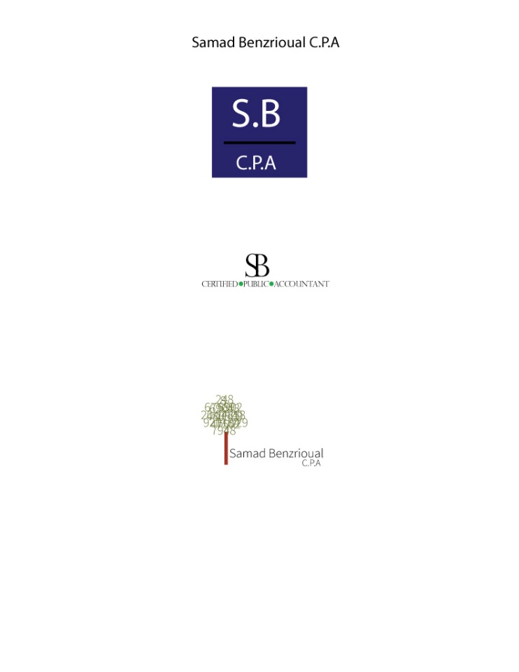
- Description: Three different logo’s for one company.
- Process (Programs, Tools, Skills): The program that I used for creating these logo’s was Adobe Illustrator. I first sketched out the logo’s and then started creating them through Illustrator. In the first I decided to do something really simple and easy to the eye. I chose a blue color to grab people’s attention. In the second logo I wanted it just be mainly about the company’s name and have what they do on the bottom. I was trying to make it look professional and yet still modern. I added a little color to make it pop more. In the third design I wanted a picture so I created a tree with numbers as leaves to represent money growing off of trees.
- Message: The message is for an accounting firm and the accountants name.
- Audience: To anyone who is looking to get their taxes done professional.
- Top Thing Learned: I learned that creating with Illustrator is harder than Photoshop and how to layer shapes on top of another.
- Three Color Scheme and Color Names:
- Analagous- Blue
- Triadic- Lime
- Triadic- Lime and Brick
- Three sets of Title / Body Font Names & Categories:
- Mayrid Pro- Sans Serif
- Perpetua Titling MT- Old style
- Source Sans Pro- Sans Serif
- Votes on favorite logo:
- Top Logo = 2; Middle Logo = 5; Bottom Logo = 3;
- My favorite logo is the middle logo.


Ashlee, I really like these! I like the impressive simplicity of these. There are little details that catch my eye like the tree having all those numbers, I think that is a phenomenal detail that you included and it looks very well done! I think that is one of my favorites but I also like the first one because of the pop of color. Check out Anne’s here: https://askidmore.wordpress.com/2015/02/22/p5-logos/
LikeLike
I really like all of your logos! I like how different they are, but my favorite is definitely the second or third. They all look professional and have great typography. Good job on this project, if you want to see another https://woodcomm.wordpress.com/2015/02/21/project-5-logos/
LikeLike
When I first saw this I really thought that it was a professionally done logo. All of them are very well done and simple. I know that sometimes I want things to have something big and in your face, but yours are so simple that they stick out in a crowd. Way to go!
LikeLike
your bottom one is my favorite of the three. I like what you did with the tree font, numbers thing. Great job
LikeLike
Hey Ashlee! Nice work here! We talked about it today in class already, but I think that your logos turned out way nice. Especially the second one. That looks super professional. Overall really nice job on your logos! Check out Anne’s blog: https://askidmore.wordpress.com/2015/02/22/p5-logos/
LikeLike